

Are you sick and tired of the 10+ years old white paint all over your house? It’s probably time to bring some color into your life! Although having to choose paint for the whole house might be intimidating, there’s no reason why you can’t turn this into a fun experience! Take a peek at this straightforward guide on how to choose the right color palette for your home!
1- Pick your favorite color and go from there.
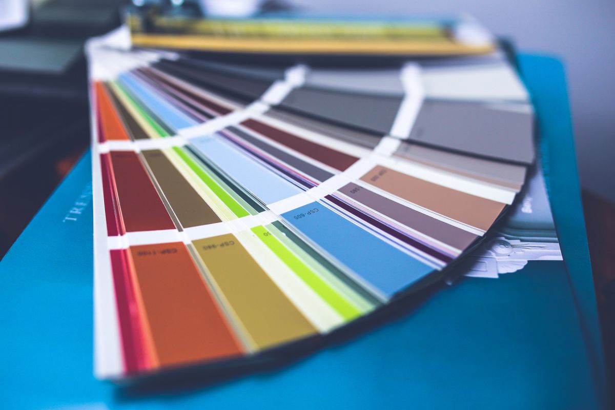
What’s your favorite color? This is the first question you should be asking yourself. However, this doesn’t mean to go paint every wall in your house that same color. It’s just a starting point to choose the main color scheme and the corresponding hues that go with it best. You can pick one or more colors to be your main and then another range of different colors, or shades of the same colors, as neutrals. It’s important to understand that your color palette must flow cohesively from one room to the next. For that reason, the main colors should be used throughout the house, but not necessarily in the same style or pattern!
2- Be guided by what you have already.
Unless you’re planning a complete remodeling of your home, it’s worth taking a look at your existing furniture and finishes. Does your color palette go with these? Say, for example, you have beige floor tiles in your living room and brown cabinets in the kitchen. In this case, you have to make sure the undertones of your tiles and cabinets are similar to those in your color palette.
What are undertones anyway?
The color you see at first glance is called the mass tone. It’s what tells you the color is red, for instance. Nevertheless, there, under this mass tone, lies a muted color called the undertone. How about if I tell you that color such as magenta has a blue undertone to it? Don’t panic, you can always seek the help of a paint expert if you have trouble uncovering your undertones. Once you’ve done that, we can guarantee you won’t be surprised by a wall that is too bright or too dim!
3- Decide how you want your place to feel like.
A well-defined color palette is, by every means, your way to achieve balance and harmony in your home. Though, how you do that is totally up to you!
When it comes to paint color schemes, you’ll usually have three styles to choose from monochromatic, analogous, and complementary. Each one of these comes with different aesthetic properties, and the only judge here is your own personal taste.
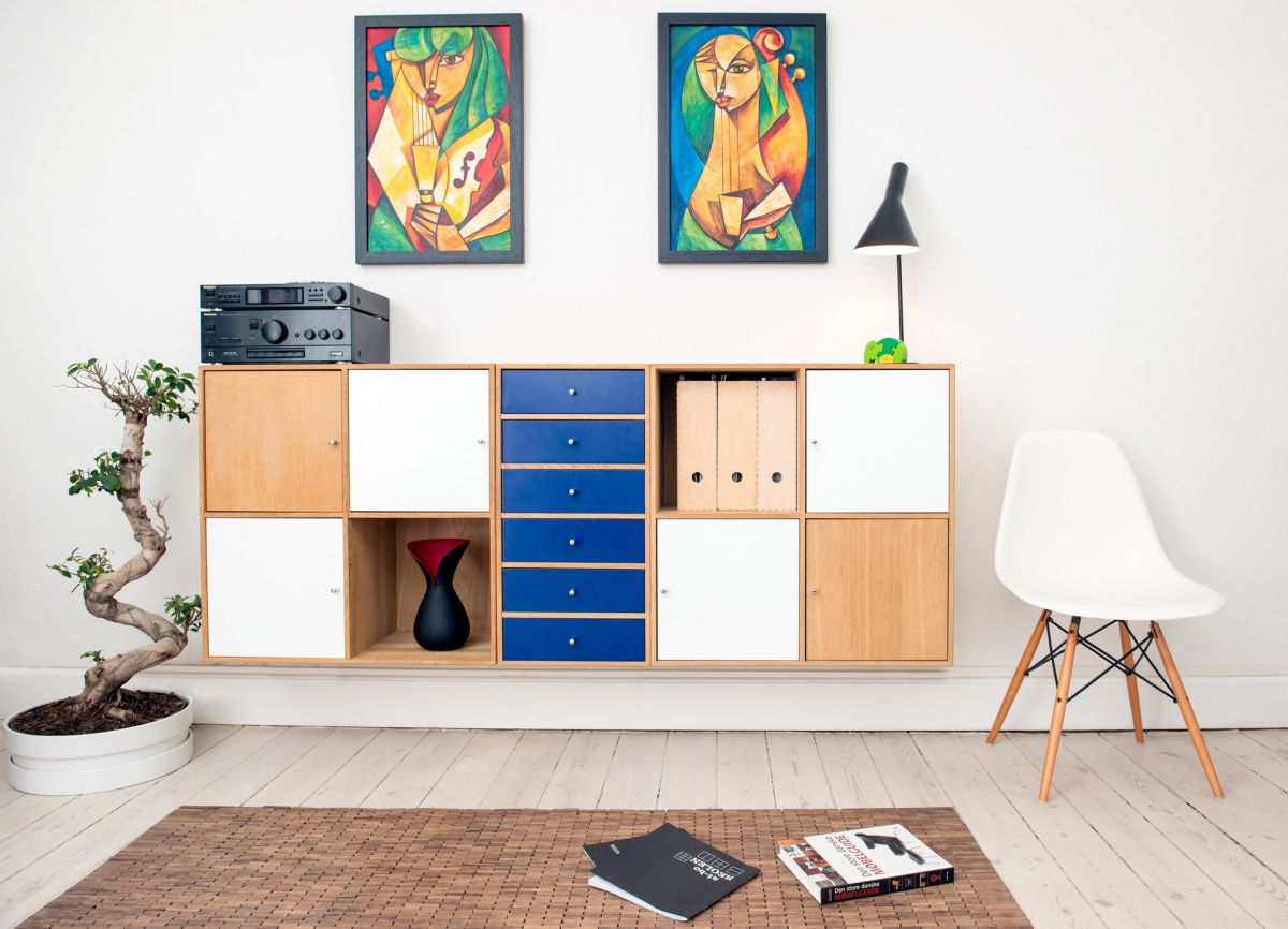
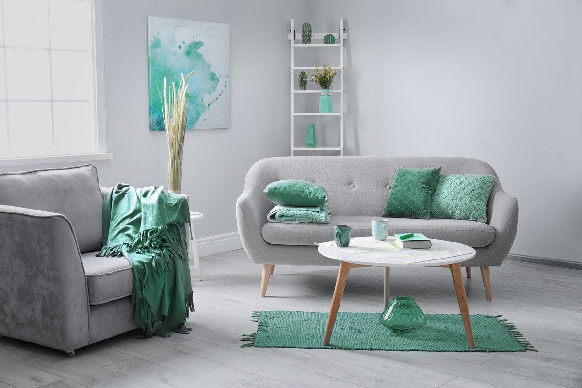
Monochromatic Color Palette
If you are more to the modern side and you like clean and laid-back environments, this style is for you. A monochromatic color scheme uses shades and hues of a particular color, refining this color to create a livable space. Think of beige, brown, and cream.
Here’s a trick: using variations of the same color to decorate a small room can make it look bigger! All the more reason to consider this style ;)
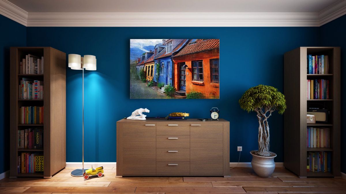
Analogous Color Palette
One of the safest and easiest ways to incorporate more colors is through the analogous color scheme. It involves three colors that are positioned next to each other on the color wheel, two are primary colors and one a mix of the two. Think of red, blue and yellow
A quick tip: to calm down the overwhelming effect of using bold colors, it’s best to add some neutral shades. Think of white, black and gray
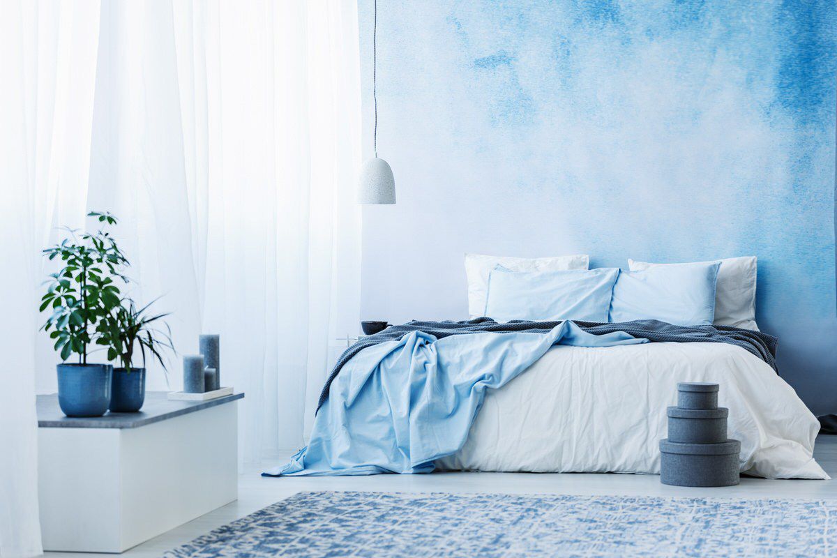
Complementary Color Palette
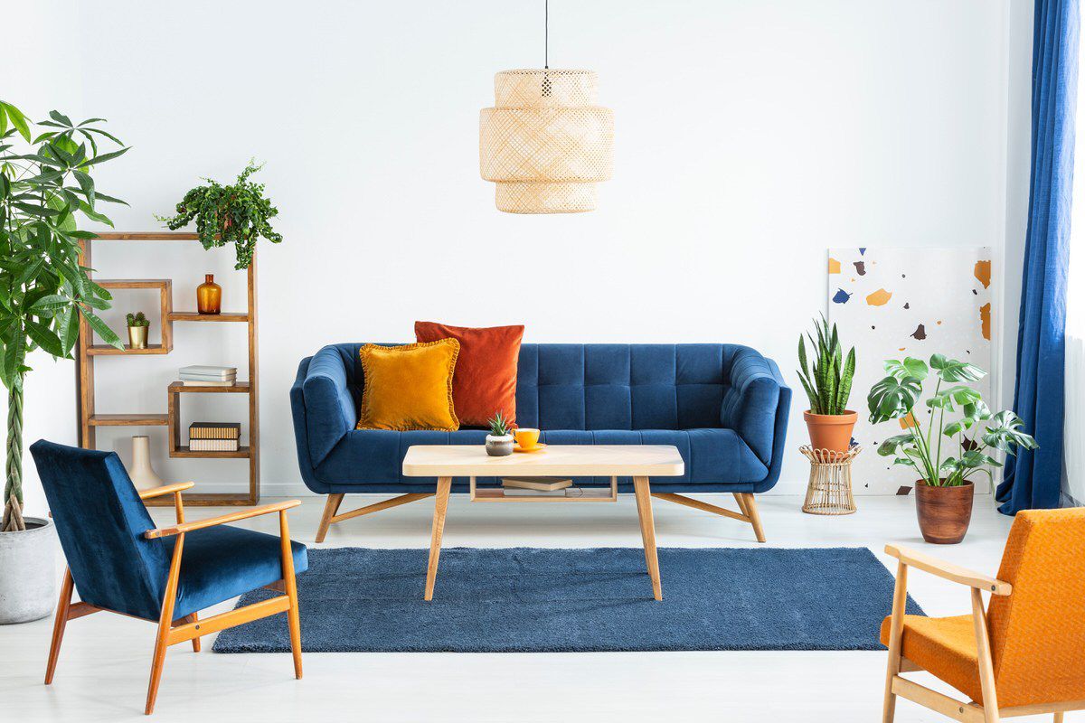
This style is perfect for those who love to feel the contrast of lively colors across the house. Essentially, a complementary color scheme includes two hues that sit opposite to each other on the color wheel. Usually, one primary color and one secondary color. Think of red and green.
A quick tip: to apply this style safely and successfully, use subdued variations of pure colors. For example, if your colors of choice are blue and orange and there appears to be a clash, you can choose a primary that’s lighter or darker in shade. Think of pale blue, Prussian blue, or denim blue.
Now that you know how it’s all done, are you still afraid to play with colors? Dropdown your thoughts!
You might also like: